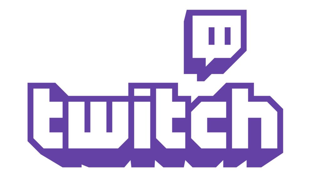
On September 26, Twitch will be launching a major brand refresh ahead of TwitchCon, updating the colour palette, Twitch logo, font and the entire community experience of the product. The new design system has been created to elevate every single person on Twitch, and to empower its communities to create together. Here’s some of what you can expect:
- Colour Palette: A new brighter purple to match the vibrant energy of the community plus more than two dozen new colours named after iconic games/pop culture (Black Ops, Ice, DK, Pika Pika, etc.). The new palette will be seen across all of Twitch and the updated Dark Mode theme will allow Twitch to easily build additional accessibility features.
- Twitch Logo and Font: Twitch is going bigger and friendlier (and less text heavy). The new logo features a bold, block letterform, with deep extrusion inspired by the retro game aesthetic. The new font, Roobert—inspired by the retro Moog synthesizer typface— is now present across Twitch.
- Video Player, Chat and Emotes: The Video player is now edge-to-edge so creators will be front and centre with chat being cleaner and easier to use than ever. Emotes are totally unchanged but plan on seeing them even more!
Below you can find a full suite of assets that will give you an idea of exactly what’s changed, including the OOO advertising campaign stateside, the new site layout, the updated logo, colour palette and some videos featuring some brand new Twitch animations.
Blog Post
Just over a year ago, we set off on a journey. Our destination: an updated Twitch brand that matches the vibrant energy of our creators and communities, so we could help clear the path on their way to becoming globally recognized icons. And with communities like ours, matching that energy is no small task.
We started with a simple truth: We were born to take on the entertainment industry, in all its forms, to add multiplayer to everything, and to help you, our creators and community members, lead the charge. Creators are at the center of everything that makes Twitch, Twitch and our job is to show up for you, support you, and to shout your names from the rooftops. Not actual rooftops, but you get the idea.
We’ve always hoped we knew how best to lift up and support our diverse, wild, and creative community and now, we really do.
We’ve come a long way and together we’ve built a passionate community of creators who consistently amaze us with their creativity and dedication. We couldn’t be prouder to have helped you create so much, but we know there are a lot of people out in the world who don’t know about Twitch—or may know about Twitch but don’t think it’s for them…yet.
So the next step was clear. We needed to do the work to make everything we’ve created together even better so you can tell your stories to the world. That means a new approach to brand design. One that lets us step back so you can step up.
A whole new approach
Our changes to the brand design system are evolutionary. What Twitch is, where we’ve been, the things our community loves…that stuff is all still here, front and center. (Purple is eternal. Purple is forever.)
Your vibrant communities are what set us apart from the rest of the internet and they’ve created a place that’s always changing, full of spirit, and wholly unique. And there are more of you than ever before.
To empower our communities to create together, we need a new design system that elevates every single person on Twitch. In our marketing on Twitch itself. So we made one. Let’s dive into it.
To a new purple, and beyond
First, there is no Twitch without purple. Period. Purple is the only color alive enough to represent our collective creativity, mischievousness, and energy. Our new purple is brighter and more vibrant to match that energy.
Purple did a lot of work to get us to where we are, and while it’s always going to be the star of the show, we thought it deserved some backup. So we’re rounding out our lineup with over two dozen new colors, all nicknamed after iconic games and pop culture characters.
These colors will show up wherever we do: On the site and apps, in our advertising, and anywhere else we need an extra splash of color to maximize our community’s expression. To bring this to life across Twitch, we’re even giving creators a new tool called Creator Color that lets them set a specific color to express themselves and their brand.
Upgrading our old friends
Our updated wordmark is designed using the DNA of our old logo, with bold, blocky letterforms that are strong, playful, and inspired by a retro gaming aesthetic.
We also updated Glitch. It’s still our shorthand way of saying ‘Twitch’ and a personification of who we are as a community, so we merely evolved its look. Any brand should worry about retaining some recognizability when updating, but, like, this is Glitch. It’s tattooed on people. We couldn’t change it too much.
Type worthy of your voice
For a brand that represents communities with unique and identifiable voices, we never really had a strong typographic identity to match. Conversations and chat at the heart of the Twitch experience, so this was an important thing to get right. When it came time to choose a new typeface, we chose Roobert. A sleek, clean, modern font, with just enough quirkiness. It’s also modeled off the retro Moog synthesizer logotype, which we thought added a few cool points. While we love the font in its original form, we made some modifications and customizations to ensure it was equally strong across marketing and product design. And when you see it in motion, how it moves should look familiar—a lot like Twitch chat, in fact.
Emotes. Or: Don’t mess with a good thing
Emotes are totally unchanged. Our community gave these beloved characters meaning, and touching them up or trying to align them all under one illustration style really didn’t feel like the right move.
What we are doing is putting emotes into the world off Twitch more often. We’re in a unique position because we have this deep, weird lore to pull from that others simply don’t, and it seemed nuts to try to make emotes less weird. So we didn’t.
Putting it all together for your brand to thrive
One of the best ways to see how all these pieces come together is to dive into Twitch itself. Our product design team took everything about our brand design and its principles and injected them into the Twitch product experience. If our goal is to help our creators tell their stories in new and exciting ways, Twitch itself needs an upgrade. Yes, the typeface, colors, and logos have been updated, but the real work was making the product experience reflect the community itself: powerful, playful, and with your voices coming through loud and clear.
Twitch.tv was originally built out of need to stream and share—and the Twitch brand grew up organically in real-time, as well. Now we hope it’s designed around what you need and deserve. There are more changes to the product experience than we can list in this blog, so we hope you’ll dig in and see it all for yourself. Behind it all was our desire to make our creators feel loved, valued, in control, and excited about telling your stories with your communities—and the world—in a more fully realized way.
This is the first of many steps we’re taking with our new shared understanding of what Twitch’s brand and product experience should be. We’re lucky to be able to support such a vibrant, passionate community of creators, viewers, and everyone in-between. These changes are all about putting you front and center and equipped to shine as you reinvent what entertainment is and can be. We can’t wait to see what you do with them.


