Considered as the most interesting Xbox One exclusive announced thus far, Project Spark is a ridiculously ambitious title that attempts to push imagination and content creation to its limits, allowing for the user creation of levels and self-contained games in one easy to use package. Launching on both Windows 8 PC’s and Xbox One later this year, I had the opportunity to take part in the very first open beta and see what exactly this curious title had to offer.
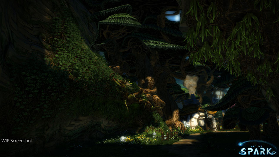
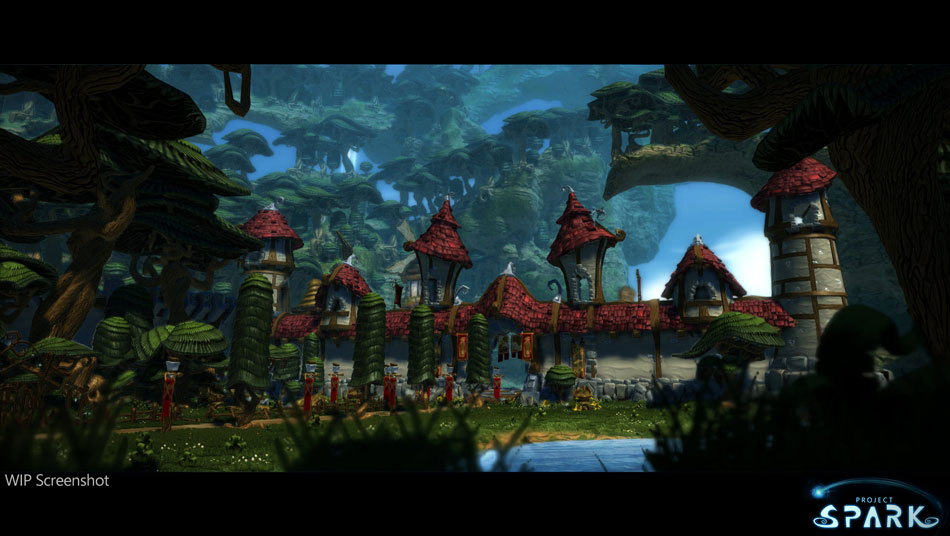
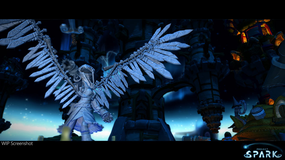
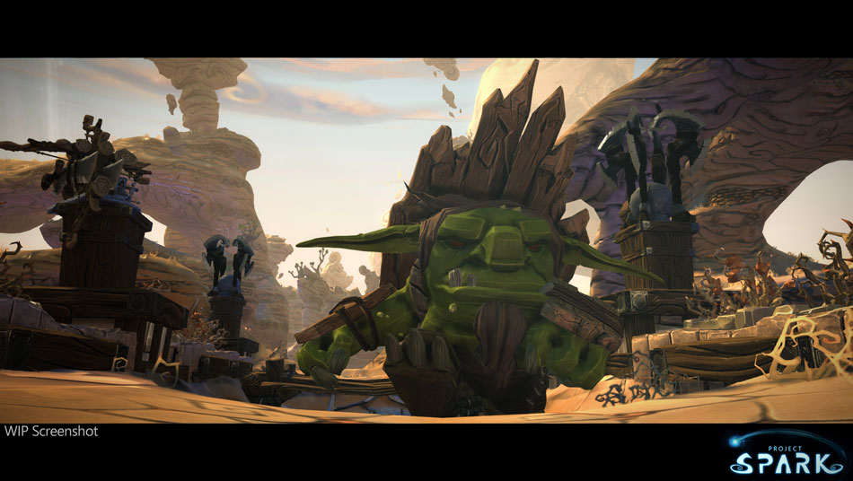
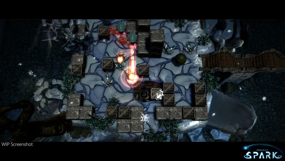
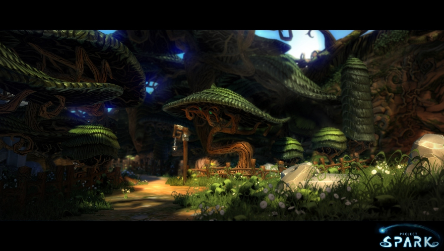
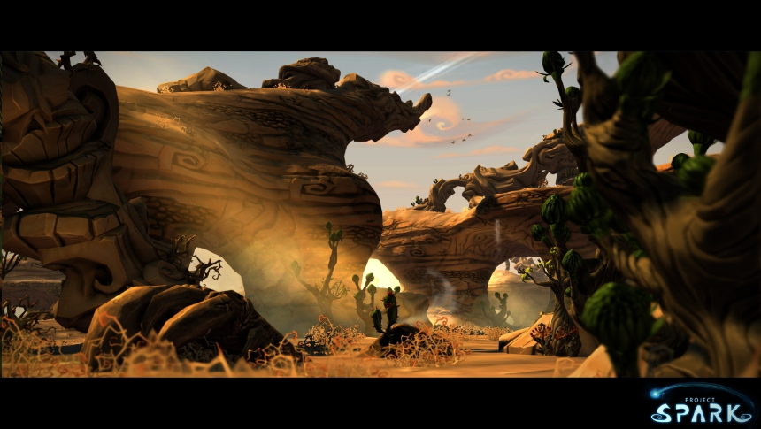
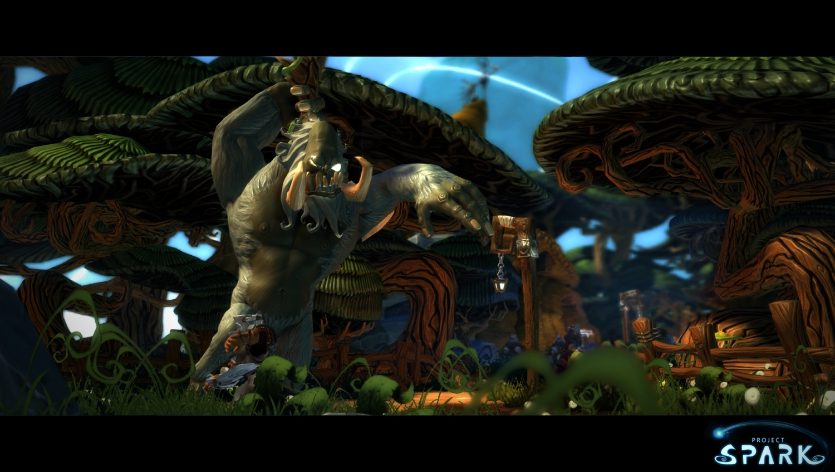
Upon starting the game the players are immediately greeted with the fantastic art style that arches over the entire game. Bright colours are rife, the game worlds and objects are full of lush character, and it all bares resemblance to beautiful hand-drawn art with an air of Disney Pixar. It is evident the developers (Team Dakota) have spent much time defining the art style of this game, and it has certainly paid off, appealing to people of all ages and most certainly catching the eye of anyone who has the pleasure of seeing it.
Unlike other content-creation games such as LittleBigPlanet, Project Spark appears to lacks a traditional single-player adventure, instead providing a mode called ‘Crossroads’, a level that is entirely directed by the player. Beginning with simple terrain choices and options, you can create a basic level environment in only a few seconds before you are thrust into playing it. At the moment only an ‘Adventure’ game type is available, though other modes such as ‘Defend’ and ‘Rebuild’ are planned for the future. Basic exploration and combat takes up the majority of this game type, and while not particularly difficult or complex, the combat mechanics are fit for purpose and fun enough, if not lacking in a certain amount of precision.
Frequently throughout the course of play you are presented with choices that define how the level plays out such as what character you control, what should happen next, or what landmark should be where. These choices are somewhat varied (though sticking to a common theme) but at the moment are very limited, with only a handful of choices provided some of which are unavailable unless they have been unlocked previously from the marketplace. It is assumed at launch there will be plenty more options to the player, of which will improve this mode considerably. That said however, what is offered is a taste of what’s to come and something that’s certainly an interesting mode that could herald more possibility than it would currently seem.
Another single-player mode will be included in the game, though it is not available to play at the moment. Entitled ‘Creation Quest’, little is known about this mode though its name suggests it could concentrate more on the content creation side of things rather than the active playing of levels. Regardless of what it offers, if Crossroads is anything to go by it could well be another promising addition to this title.
It cannot be denied that the main draw for Project Spark players is that of the creation suite, a series of rather powerful tools that allows for the creation of User-Generated Content in the form of levels and even entire games. I have spent rather a lot of time with this system, experimenting with each feature and it has to be said that I am rather impressed. As is always key with any game such as this the prospect of creating anything has to be simple enough for anyone to pick up and play, and it’s good to report that for the most part Team Dakota have achieved this. Terrain creation for example is a very simple task and within a couple of minutes players can have a great looking game environment. This is made even more true thanks in part to the selection of terrain sculpting tools available for use. On top of the conventional expand /erode, add/subtract, and smooth/roughen tools, players can also tunnel easily into terrain and cubify environments. The scope is pretty large and this aspect is particularly strong, allowing the creation of many unique looking levels to suit any purpose.
Terrain is easily painted with a vast array of materials and it feels as simple and as natural as you would expect, using the cursor to paint the terrain as you please making use of the extensive camera controls to make sure that every piece of terrain is painted correctly. The materials available are varied enough and look great, fully complementing the art style of the game with plenty of vibrant colour. Game assets and characters are easily placed into the levels too with the players selecting objects from a catalogue and dragging them into the scene. It’s all very easy and within no time at all players can have a small scene/level populated.
It’s unfortunate then that the only aspect to disappoint in this feature set is that of the ‘Brain’, a feature whereby players script and code the levels so they work as you desire. Brains work off two inter-linking systems called ‘when’ and ‘do’, and this is probably as simple as coding/scripting can get for those that have never done it before. When something happens in the game, you want it to do something in response, and the brains categorise it like this so that it is simple to read and understand. Thankfully players don’t have to deal with lines and lines of code, instead they are faced with tiles that hold certain functions or properties. Not having to deal with actual code helps to not boggle the mind too much and create a very user-friendly experience.
There are multiple pre-built brains that are included from the very beginning that cater to a variety of gameplay styles and functions. These work nicely and are a great addition for those that don’t want to design brains from scratch, but for those that do want to create they might feel a little too conventional. Starting from a clean slate may seem daunting at first, but once you take some time to learn how brains work it’s entirely possible to create some wild ideas. This however is where the problems surface, with a lot of the tiles (the code snippets you use to build brains) being unclear to the user, with a lack of proper and easy to understand descriptions for each tile leaving you in a state of confusion. While there is a basic tutorial that can be played, it is just that, a very basic tutorial that fails to delve into anything complicated. This means that in its current state players have to undertake a lot of trial and error to get an idea to work, often spending more time doing this than anything productive. This becomes frustrating and without a full description it can frequently frustrate anyone wanting to create. This lack of description and in-depth tutorial also makes translating your ideas to the ‘when’ and ‘do’ system rather difficult, and I often found myself fumbling around trying to make a simple idea work and finding the correct tiles that will work together.
Though there are lots of tiles that hold a wealth of properties within brains, it is unclear how free players are to create whatever they want. While there are plenty of options, in due time players may find that the ‘when’ and ‘do’ system is to be a little restrictive, finding that some ideas don’t translate well to that format. This concern is perhaps raised further with the applications of the pre-built brains. These could be in place to demonstrate everything the game is capable of, instead of showing a fraction of what Project Spark can do. Though I believe it is just to sample its abilities, I am unsure. This concern will certainly not be alleviated anytime soon, and only as we reach the games release and see what players can do will we know for certain if there are any restrictions at all. However at such an early stage these thoughts can be put at the back of the mind because this is by no means the full product.
Largely I have no complaints with the UI, it is as simple as it gets and if you are using an Xbox controller it works brilliantly. It’s a shame that for mouse and keyboard users it isn’t as fluid, and I would appreciate it if the developers looked at creating a slightly different UI for those using that as an input. It just feels a little unnecessary to have to go through countless radial menus and a few cumbersome slide-out and drop-down menus using a mouse, not to mention that it slows the work flow down. That said however it is perfectly usable, it’s just not the fastest thing in the world for mouse-users.
As it stands there are very few community levels that showcase the games capabilities. While there are some which attempt a new concept, they fail to both wow and prove that everyone has the potential to make something fantastic. That’s not to say Project Spark isn’t capable, it’s more that this game and its creation tools are very new and take some getting used to. Not to forget the aforementioned problem with the lacking tile explanations when building a brain. There are however some levels created by Team Dakota themselves that are shared within the community, of which are a good indication of what is to come further down the line. While again these aren’t ‘wow’ material, they do offer a glimpse at the variety of levels that can be made and display how well made the brain system is when put to full use.
As an incentive to create and play community levels, the game features a levelling up system that associates with your profile. There are specific achievements that are built into the game, and accomplishing them awards XP. Levelling up not only increases your reputation as a Project Spark player, but also rewards players with coins that can be spent on additional content.
The Marketplace attached to this game offers a wealth of additional items, buildings, environment pieces etc. to go alongside the games rather stale base content. Purchasing of more content is certainly encouraged, and while micro-transactions are integrated for those willing to part with actual money, everything is purchasable using the in-game currency earned through completing levels, levelling up, and accomplishing milestones to name but a few. It’s a nice system and a great incentive to actively seek out new level creations and to create things yourself, as well as sharing many levels as possible with the world. Though the marketplace seems well thought out, the pricing of these objects seems a little ridiculous, with even the smallest of objects costing high amounts. I would like to see this being addressed as it feels tiresome to have to work that hard in order to earn enough currency to pay for anything, let alone the item you are after. Perhaps my favourite feature to the marketplace is the ability to enter a level that showcases the items that are up for sale. Players can interact all they want with these items and it’s the best way to go shopping instead of staring blankly at several menus in the games extensive object catalogue. Interacting this way with the items allows the player to gauge whether or not that item is what they want, and it works brilliantly.
Project Spark certainly withholds the reputation it created at last year’s E3. While it is in its early stages and the content available here is limited (with certain features unavailable outright), it does a brilliant job of showcasing it’s potential, re-affirming that this title is worth looking out for in the coming months as it nears release. Though concerns are raised with how much the game restricts your creativity, the game is still impressive even when limited to specific frameworks. Only time will tell what this games toolset allows you to create, with the community levels feeling very much uninspired at the time of writing. That said, this game has sparked plenty of interest within me and I look forward to seeing this title grow and hopefully become the Xbox One’s first killer title!



You must be logged in to post a comment.