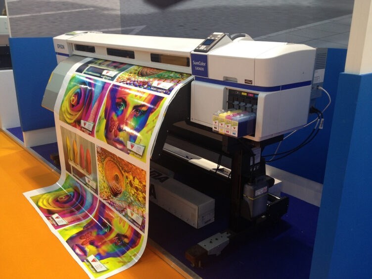
You’re printing some new business posters. You’re not sticking to the standard paper printouts. You’ve been to the art shop and bought some awesome new paper; it looks and feels great. And you’ve got some money to blow on a new poster design.
But to your dismay, it looks as amateur as ever.
It happens all the time. Even the most experienced poster designers mess up occasionally. Read on to find out what the most common mistakes in business poster designs are and how to avoid them all.
1. Inconsistent Brand Elements
When creating a business poster design, it’s important to ensure that the brand elements are consistent. Common mistakes in business posters may include not using the right fonts or the wrong size images. By ensuring the brand elements are consistent, the poster will be more effective in communicating the brand’s message.
To avoid these mistakes, use a legible and appropriate font to quote the statement. Use images on posters that are large enough to be seen from a distance, and use consistently-branded colors throughout. Learn how to make quote poster to convey the message.
Properly implementing brand elements can be a powerful way to create a successful business poster, strengthening the company’s identity and creating an overall polished, professional look.
2. Unclear Calls to Action
A common mistake in business poster designs is having an unclear call to action. It is important to have a purpose for the poster and define your target audience. By including a statement that points out what the business offers and who it is for, it will be easier for viewers to understand what you are trying to accomplish.
Additionally, make sure the call to action stands out using bold fonts, bright colors, and captivating images. This will allow the message to be communicated more effectively, and you can encourage the viewer to take further action.
3. Incorrect Color Pairings
Incorrect color pairings can often ruin a good business poster design. It is important to select colors that appear aesthetically pleasing and fit with your business’s branding and message. Bright colors can appear overwhelming and lack continuity, while overly muted colors may not stand out enough.
A careful combination of colors can help create balance in a design. However, too many colors can take away from the poster’s purpose.
4. Inadequate Use of Space
Too often, designers will fill all of the available space on a poster with loads of text on posters, pictures, or logos that make it look busy and cluttered. This defeats the purpose of a poster – to make a large impression without being overwhelming. To avoid this, it’s important to be selective with content and create a poster that is clear and concise.
Make sure that the size of the design elements is balanced, and keep a consistent vertical and horizontal balance of elements within the poster. Finally, it’s important to use white space to separate elements and draw the eye to the main message. This will help to create a visually appealing poster that communicates the desired message clearly.
Common Mistakes in Business Poster Designs
When designing your business posters, remember to avoid clutter and keep the text concise, use a large, bold font and contrasting colors, and use photos and graphics to help communicate your message. By avoiding these common mistakes in business poster designs, your posters will stand out and produce the desired result that you, and your business, strive for.
Get started on creating a stunning poster design today!
For more design inspiration and tools, explore our site and create beautiful posters for your business.
Want more news from the Tech world for Gaming Peripherals to Hardware Click Here


